Branding › iClear
iClear brand identity
A clean, premium look for home water purification.
Home water purification · 2025 · Social campaigns, Product promos, Seasonal campaigns, Roll-up banners, 9 designs
The brief
iClear sells home and office water purifiers in Nairobi and Nakuru. The brand needed social and print work that makes a technical product feel premium and easy to trust, and stays recognisable across promotions, lifestyle posts and in-store print.
What I did
- Built the look on deep navy and aqua, taken straight from the drop logo.
- Paired a heavy, high-contrast serif for headlines with light Poppins for details: premium, but easy to read.
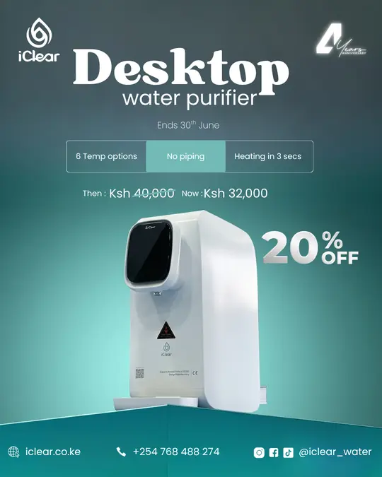
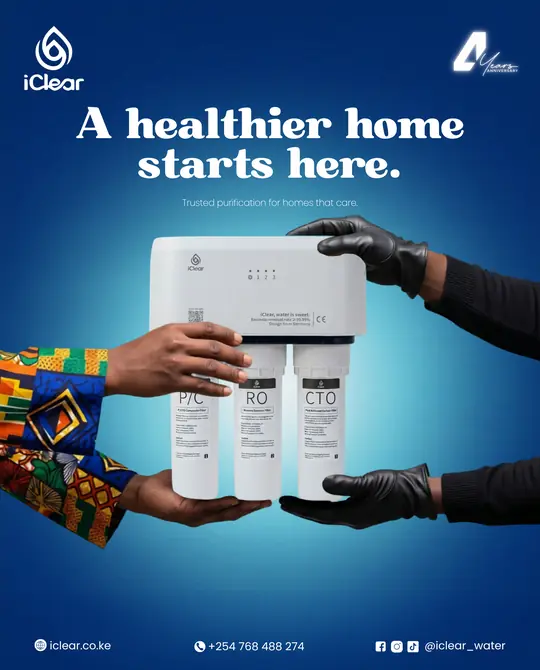
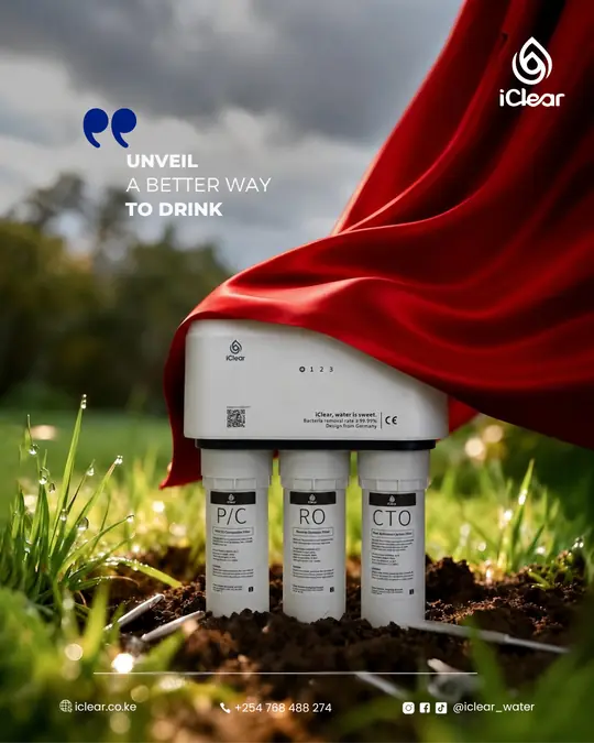
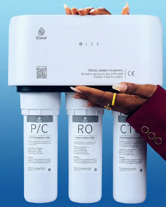
- Lit every purifier like a hero product, with a spotlight glow behind the white unit.
- Fixed the logo top left and the same contact strip at the bottom of every post, then carried the system onto roll-up banners.
Colour palette
- Midnight (#022967): Backgrounds of hero and product posts
- Royal Blue (#0653B1): Gradients, sky and depth
- Sky Cyan (#60D4E3): Spotlight glow and gradient start
- Aqua Drop (#08E6BE): The logo mark, checks and highlights
- Mist (#EAF2FA): Canvas for lifestyle posts
- Pure White (#FFFFFF): Headlines on dark, the product itself
Typography
- Abril Fatface: Headlines
- Poppins Light: Subheads, details and contact strip
- Poppins ExtraBold Italic: Punchy lifestyle lines
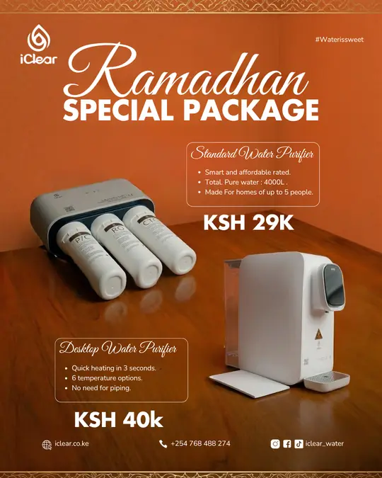
- Great Vibes: Seasonal campaigns
Templates
- Promotions: Offer-led: serif headline, feature bar, then-and-now price, deadline.
- Product: The purifier as hero, lit by a spotlight on deep navy.
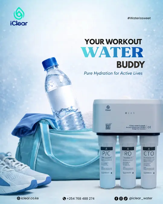
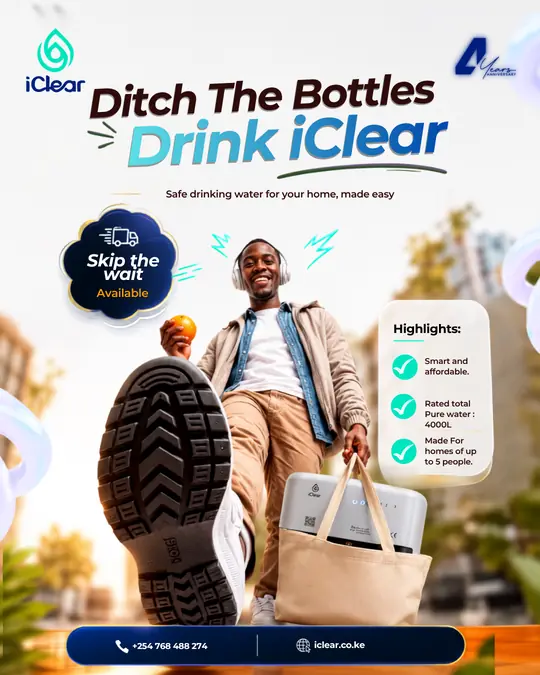
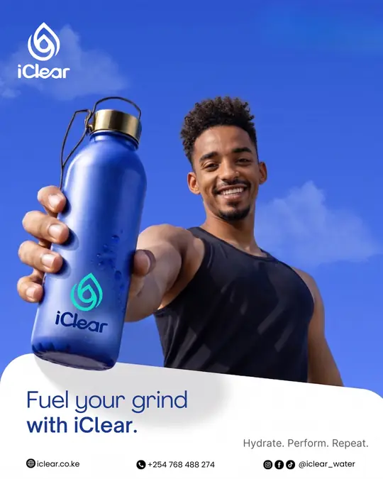
- Lifestyle: People and moments: workouts, commutes, everyday hydration.
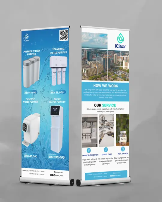
- Print: Roll-up banners for shops and events, same colours and type.
The work
See more mockups for iClear · More brand identity and media kit work · Start a project