Branding › Duara Schools
Duara Schools brand identity
A warm, confident identity for a network of community microschools.
Early-years education · 2025 · Brand refresh, Typography, Colour system, Social templates, 15+ posts
The brief
Duara runs affordable community microschools in Kamirithu, Gathiga, Riruta and Kitengela. The school wanted a total revamp of its brand so its social media would look attractive to parents and be recognisable as Duara at a glance.
What I did
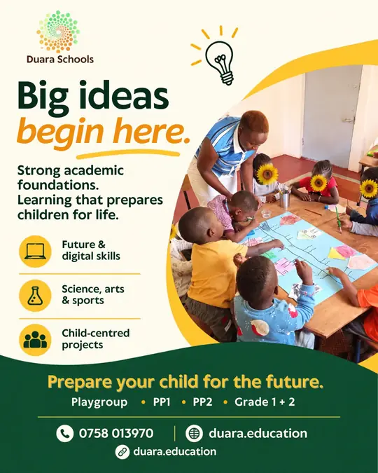
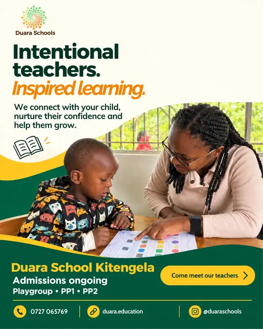
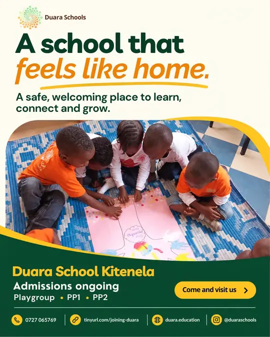
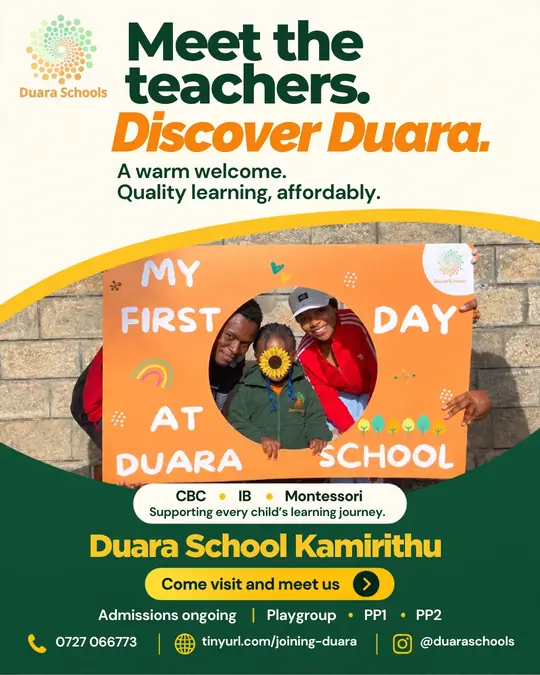
- Kept the dotted sunflower logo and built the palette out of its greens, yellows and oranges.
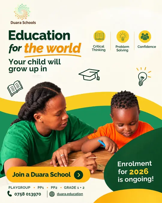
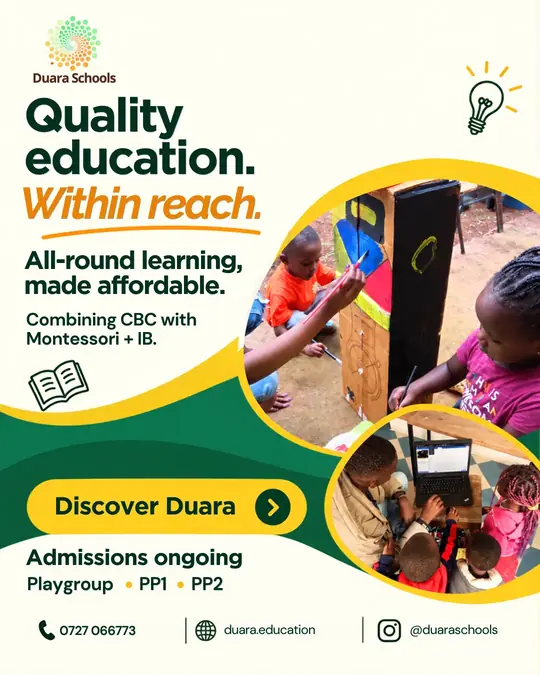
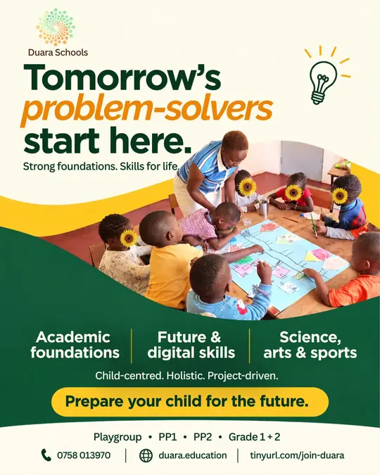
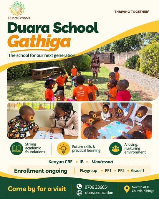
- Set one headline voice: heavy dark green, with a single italic orange phrase carrying the emotion.
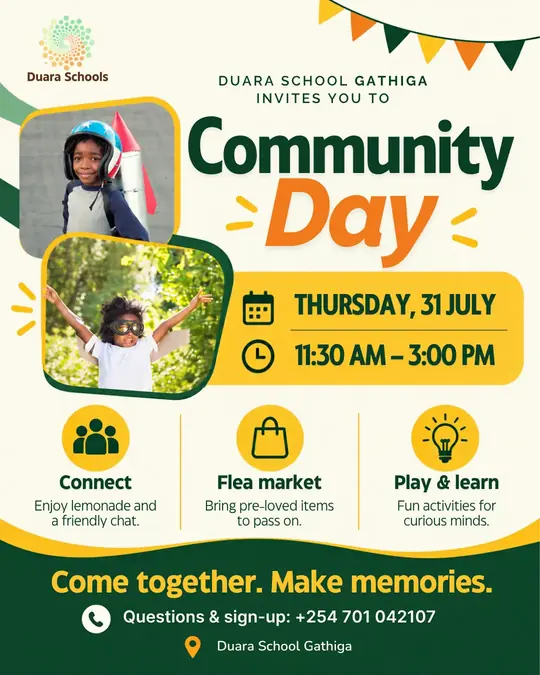
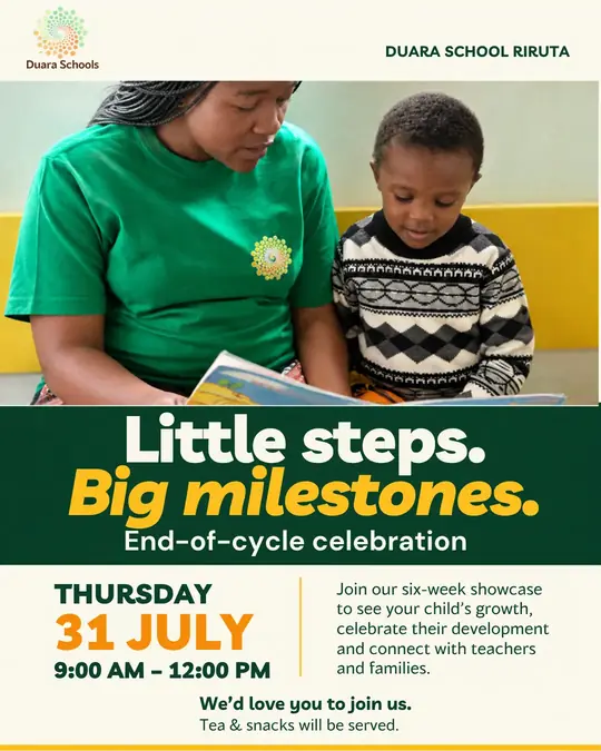
- Designed a wave frame, pill button and contact strip that repeat on every post, so the feed reads as one family.
- Made three templates (Admissions, Parent Voices, Events) that the school can reuse for every campus.
Colour palette
- Chalk Cream (#FDFAEE): Canvas for every post
- Forest Ink (#05321E): Headlines and body text
- Duara Green (#035C40): Footer band and wave
- Sunflower (#F9C71D): Buttons, icons, wave edge
- Marigold (#EE850B): The italic accent phrase
- Earth (#6D3920): Logo wordmark only
Typography
- Plus Jakarta Sans ExtraBold: Headlines
- Plus Jakarta Sans ExtraBold Italic: Accent phrase
- Lato: Subheads, quotes and contact details
- Oswald SemiBold: Event dates and times
Templates
- Admissions: Headline, wave-framed photo, green footer with a pill button.
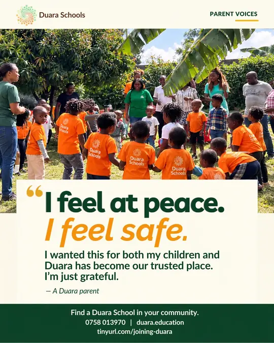
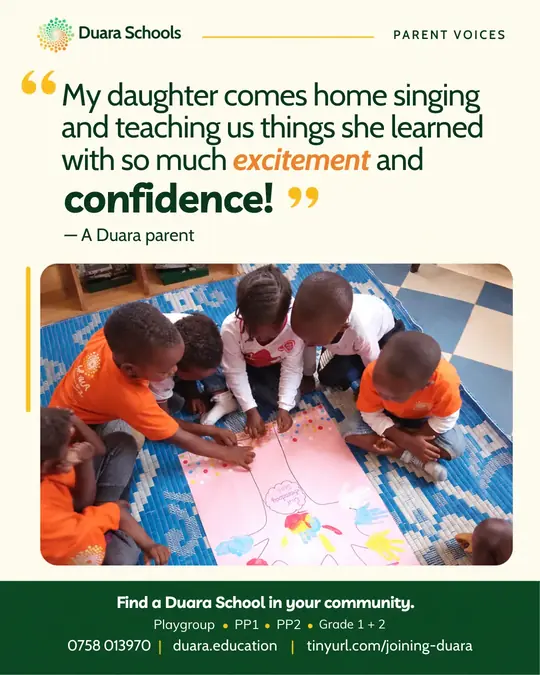
- Parent Voices: A real parent quote set big, framed by the logo bar and footer.
- Events: Date-led layouts for open days and celebrations.
The work



See more mockups for Duara Schools · More brand identity and media kit work · Start a project